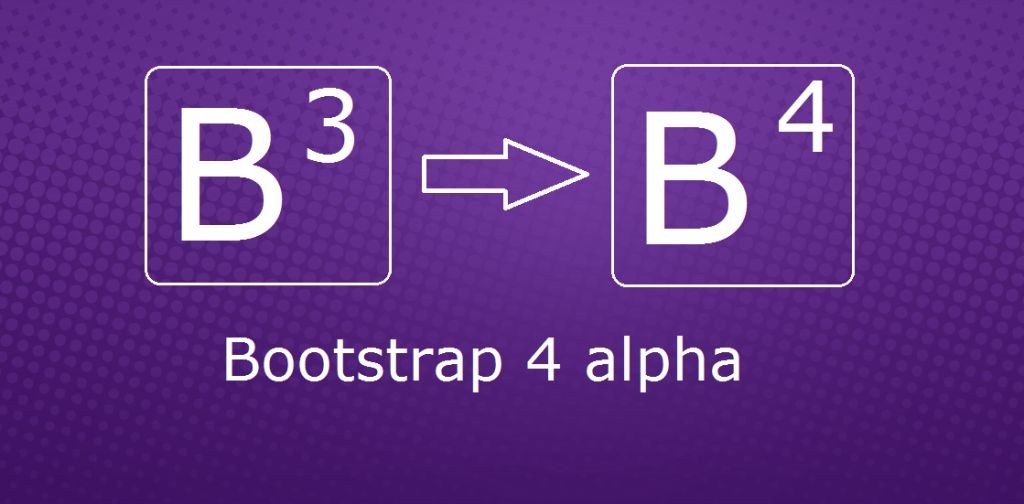
Bootstrap 4 is a major rewrite of almost the entire project. The most notable changes are summarized immediately below, followed by more specific class and behavioral changes to relevant components.
Browser support
- Dropped IE8 and iOS 6 support. v4 is now only IE9+ and iOS 7+. For sites needing either of those, use v3.
- Added official support for Android v5.0 Lollipop’s Browser and WebView. Earlier versions of the Android Browser and WebView remain only unofficially supported.
Global changes
- Switched from Less to SCSS for our source CSS files.
- Switched from
pxtoremas our primary CSS unit. - Global font-size increased from
14pxto16px. - Added a new grid tier for ~
480pxand below. - Replaced the separate optional theme with configurable options via SCSS variables (e.g.,
$enable-gradients: true).
Components
- Dropped panels, thumbnails, and wells for a new all-encompassing component, cards.
- Dropped the Glyphicons icon font. If you need icons, some options are:
- the upstream version of Glyphicons
- Octicons
- Font Awesome
- Dropped the Affix jQuery plugin. We recommend using a
position: stickypolyfill instead. See the HTML5 Please entry for details and specific polyfill recommendations.- If you were using Affix to apply additional, non-
positionstyles, the polyfills might not support your use case. One option for such uses is the third-party ScrollPos-Styler library.
- If you were using Affix to apply additional, non-
- Refactored nearly all components to use more unnested classes instead of children selectors.
Misc
- Non-responsive usage of Bootstrap is no longer supported.
- Dropped the online Customizer in favor of more extensive setup documentation and customized builds.
By component
This list highlights key changes by component between v3.x.x and v4.0.0.
Reboot
New to Bootstrap 4 is the Reboot, a new stylesheet that builds on Normalize with our own somewhat opinionated reset styles. Selectors appearing in this file only use elements—there are no classes here. This isolates our reset styles from our component styles for a more modular approach. Some of the most important resets this includes are the box-sizing: border change, moving from rem to em units on many elements, link styles, and many form element resets.
Typography
- Moved all
.text-utilities to the_utilities.scssfile. - Dropped the
.page-headerclass entirely. .dl-horizontalnow requires grid classes, increasing flexbility in column widths.- Custom
<blockquote>styling has moved to classes—.blockquoteand the.blockquote-reversemodifier.
Images
- Renamed
.img-responsiveto.img-fluid.
Tables
- Nearly all instances of the
>selector have been removed, meaning nested tables will now automatically inherit styles from their parents. This greatly simplifies our selectors and potential customizations. - Responsive tables no longer require a wrapping element. Instead, just put the
.table-responsiveright on the<table>. - Renamed
.table-condensedto.table-smfor consistency. - Added a new
.table-inverseoption. - Added a new
.table-reflowoption. - Added table header modifers:
.thead-defaultand.thead-inverse
Forms
- Moved element resets to the
_reboot.scssfile. - Renamed
.control-labelto.form-control-label. - Renamed
.input-lgand.input-smto.form-control-lgand.form-control-sm, respectively. - Dropped
.form-group-*classes for simplicity’s sake. Use.form-control-*classes instead now. - Horizontal forms overhauled:
- Dropped the
.form-horizontalclass requirement. .form-groupno longer mixins the.rowclass, so it’s now required for grid layouts.- Added new
.form-control-labelclass to vertically center labels with.form-controls.
- Dropped the
Buttons
- Renamed
.btn-defaultto.btn-secondary. - Dropped the
.btn-xsclass entirely. - The stateful button feature of the
button.jsjQuery plugin has been dropped. This includes the$().button(string)and$().button('reset')methods. We advise using a tiny bit of custom JavaScript instead, which will have the benefit of behaving exactly the way you want it to.- Note that the other features of the plugin (button checkboxes, button radios, single-toggle buttons) have been retained in v4.
Grid system
- Added a new
~480pxgrid breakpoint, meaning there are now five total tiers.
Button group
- Dropped the
.btn-group-xsclass entirely.
Navs
- Dropped nearly all
>selectors for simpler styling via un-nested classes. - Instead of HTML-specific selectors like
.nav > li > a, we use separate classes for.navs,.nav-items, and.nav-links. This makes your HTML more flexible while bringing along increased extensibility.
Navbar
- Dropped the
.navbar-formclass entirely. It’s no longer necessary.
Pager
- Renamed
.previousand.nextto.pager-prevand.pager-next.
Pagination
- Explicit classes (
.page-item,.page-link) are now required on the descendants of.paginations
Panels, thumbnails, and wells
Dropped entirely for the new card component.
Panels
.panelto.card.panel-defaultremoved and no replacement.panel-headingto.card-header.panel-titleto.card-title.panel-bodyto.card-block.panel-footerto.card-footer.panel-primaryto.card-primaryand.card-inverse.panel-successto.card-successand.card-inverse.panel-infoto.card-infoand.card-inverse.panel-warningto.card-warningand.card-inverse.panel-dangerto.card-dangerand.card-inverse
Carousel
- Renamed
.itemto.carousel-item.
Utilities
- Added
.pull-{xs,sm,md,lg,xl}-{left,right,none}classes for responsive floats - Removed
.pull-leftand.pull-rightsince they’re redundant to.pull-xs-leftand.pull-xs-right
Documentation
Our documentation received an upgrade across the board as well. Here’s the low down:
- We’re still using Jekyll, but we have custom plugins in the mix:
example.rbis a fork of the defaulthighlight.rbplugin, allowing for easier example-code handling.callout.rbis a similar fork of that, but designed for our special docs callouts.
- All docs content has been rewritten in Markdown (instead of HTML) for easier editing.
- Pages have been reorganized for simpler content and a more approachable hierarchy.
- We moved from regular CSS to SCSS to take full advantage of Bootstrap’s variables, mixins, and more.
What’s new
We’ve added new components and changed some existing ones. Here are the new or updated styles.
| Component | Description |
|---|---|
| Cards | New, more flexible component to replace v3’s panels, thumbnails, and wells. |
| New navbar | Replaces the previous navbar with a new, simpler component. |
| New progress bars | Replaces the old .progress <div> with a real <progress> element. |
| New table variants | Adds .table-inverse, table head options, replaces .table-condensed with .table-sm, and .table-reflow. |
| New utility classes |
TODO: audit new classes that didn’t exist in v3
What’s removed
The following components have been removed in v4.0.0.
| Component | Removed from 3.x.x | 4.0.0 Equivalent |
|---|---|---|
| Panels | Cards | |
| Thumbnails | Cards | |
| Wells | Cards | |
| Justified navs |
TODO: audit classes in v3 that aren’t present in v4
Responsive utilities
The following deprecated variables have been removed in v4.0.0:
@screen-phone,@screen-tablet,@screen-desktop,@screen-lg-desktop. Use the more abstract$screen-{xs,sm,md,lg,xl}-*variables instead.@screen-sm,@screen-md,@screen-lg. Use the more clearly named$screen-{xs,sm,md,lg,xl}-minvariables instead.@screen-xs,@screen-xs-min. The extra small breakpoint has no lower bound, so these variables were logically absurd. Reformulate your expression in terms of$screen-xs-maxinstead.
The responsive utility classes have also been overhauled.
- The old classes (
.hidden-xs.hidden-sm.hidden-md.hidden-lg.visible-xs-block.visible-xs-inline.visible-xs-inline-block.visible-sm-block.visible-sm-inline.visible-sm-inline-block.visible-md-block.visible-md-inline.visible-md-inline-block.visible-lg-block.visible-lg-inline.visible-lg-inline-block) are gone. - They have been replaced by
.hidden-xs-up.hidden-xs-down.hidden-sm-up.hidden-sm-down.hidden-md-up.hidden-md-down.hidden-lg-up.hidden-lg-down. - The
.hidden-*-upclasses hide the element when the viewport is at the given breakpoint or larger (e.g..hidden-md-uphides an element on medium, large, and extra-large devices). - The
.hidden-*-downclasses hide the element when the viewport is at the given breakpoint or smaller (e.g..hidden-md-downhides an element on extra-small, small, and medium devices).
Rather than using explicit .visible-* classes, you make an element visible by simply not hiding it at that screen size. You can combine one .hidden-*-up class with one .hidden-*-down class to show an element only on a given interval of screen sizes (e.g. .hidden-sm-down.hidden-xl-up shows the element only on medium and large devices).
Note that the changes to the grid breakpoints in v4 means that you’ll need to go one breakpoint larger to achieve the same results (e.g. .hidden-md is more similar to .hidden-lg-down than to .hidden-md-down). The new responsive utility classes don’t attempt to accommodate less common cases where an element’s visibility can’t be expressed as a single contiguous range of viewport sizes; you will instead need to use custom CSS in such cases.
Misc notes to prioritize
- Removed the
min--moz-device-pixel-ratiotypo hack for retina media queries - Dropped
.hiddenand.showbecause they conflict with jQuery’s$(...).hide()and$(...).show()methods. - Change buttons’ [disabled] to
:disabledas IE9+ supports:disabled. Howeverfieldset[disabled]is still necessary because native disabled fieldsets are still buggy in IE11.TODO: audit list of stuff in v3 that was marked as deprecated
Additional notes
- Removed support for styled nested tables (for now)
